


Vida Sana Pilates Studio
SERVICES:
Brand, Instagram, Website
BRAND ESSENCE:
Minimal, luxe, earthy
ABOUT
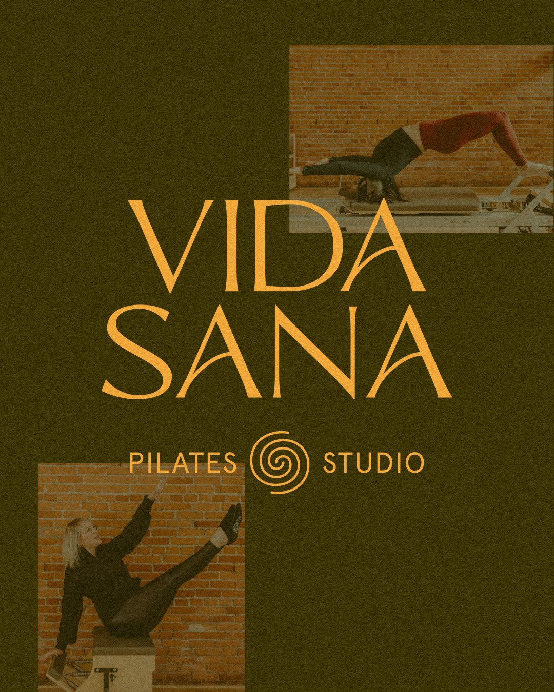
Vida Sana is a luxurious yet warmhearted Pilates studio nestled in the Redwoods of Northern California; Humboldt County. Vida Sana cultivates a community of people who come together for their health and wellness through the Pilates practice.
They are the go-to studio in Humboldt county, with highly trained teachers who create a fun, safe space for the students. It was time for Vida Sana to have a rebrand that reflects their studio.
THE BRAND
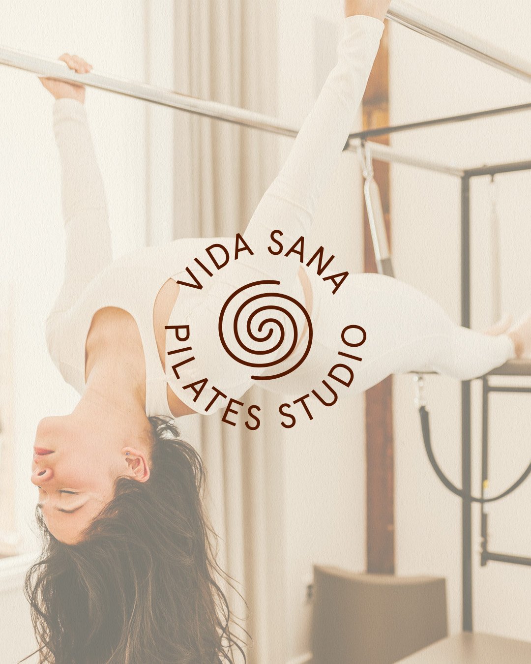
The direction for Vida Sana’s rebrand was strong, minimal, earthy and warm. Shown through the strong hand-lettered typography, earthy and warm color palette, and font suite, and supporting illustrations. The spiral in the logo plays an homage to the spiral from the original brand, which is a symbol from the Taino Indians meaning cosmic energy and unendingness, which is meaningful to the founder and represents the growth and community of Vida Sana and the Pilates practice.
Section Styles underline
Section Styles borderfullwidth


Section Styles full-width


Section Styles full-width
